Metrics
Response Time
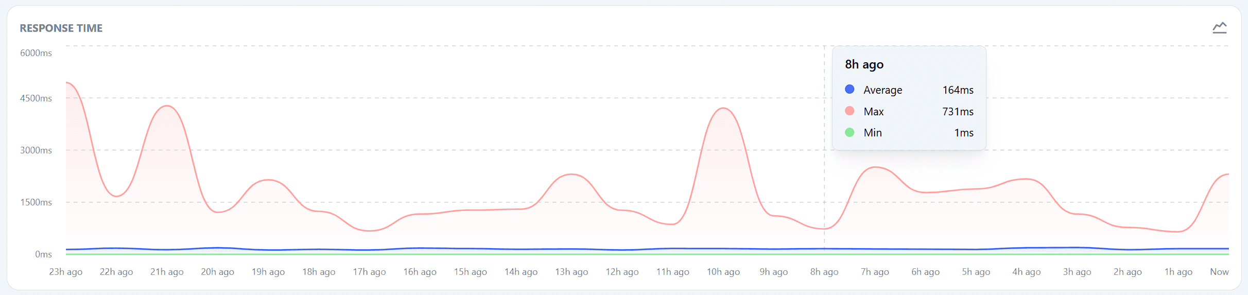
Latency trend visualization highlighting performance shifts over time.
Key Information
- Average Response Time: Shown as a blue line, this represents the average response time across all monitored services.
- Maximum Response Time: Shown as a red area, this highlights the highest response time recorded among your services.
- Minimum Response Time: Shown as a green line, this indicates the lowest response time recorded.
How to Use
- Monitor Overall Performance: This graph gives you a quick snapshot of the overall performance of all your services. Spikes in the graph may indicate issues that require further investigation.
- Detailed Analysis: For a more detailed analysis of response times for individual monitors, you can click on a specific monitor within the Monitors section. This will take you to a detailed response time graph for that particular service.
Actionable Steps
- Investigate Performance Spikes: If you notice unusual spikes or trends in the response time graph, it’s important to investigate which services are causing these issues.
- Optimize Services: Use the information from this graph and the detailed monitor-specific graphs to identify and optimize poorly performing services.
Related Pages
- For more detailed information on individual monitor response times, visit the Monitors section.
Monitoring response times is crucial to ensuring your services are performing optimally. The Response Time graph provides a high-level view, while individual monitor graphs offer the detailed insights needed for troubleshooting and optimization.